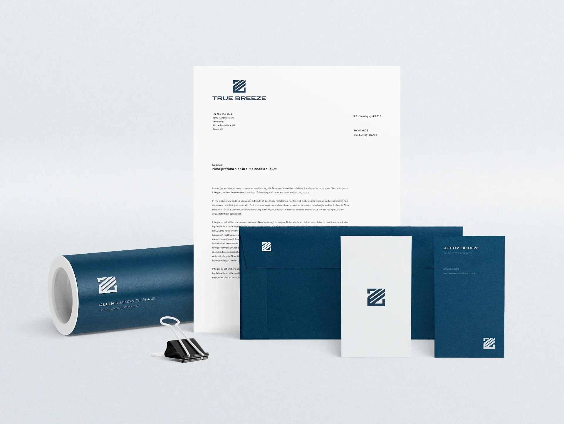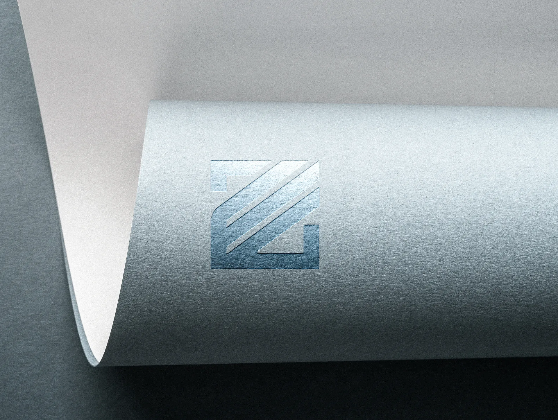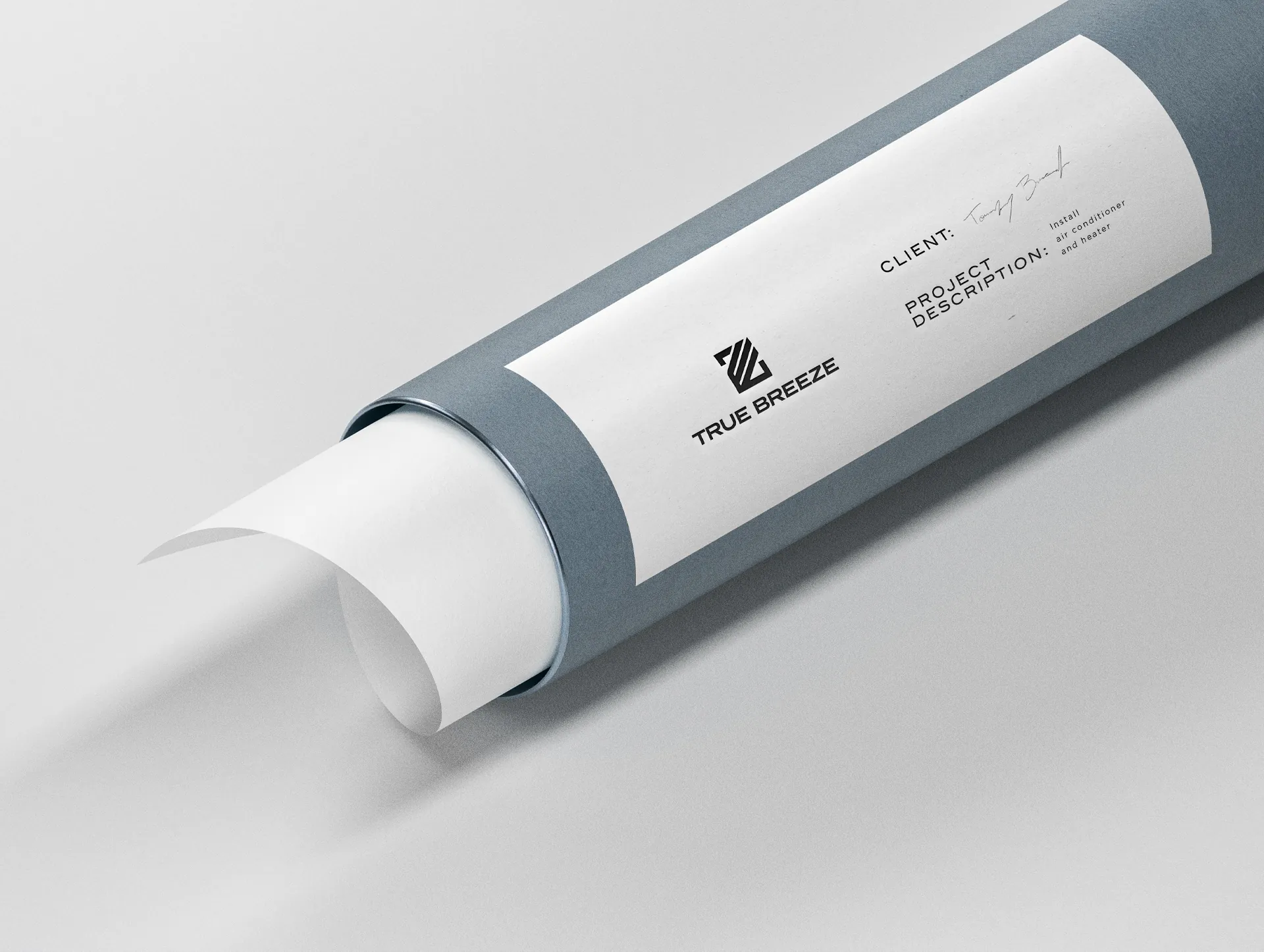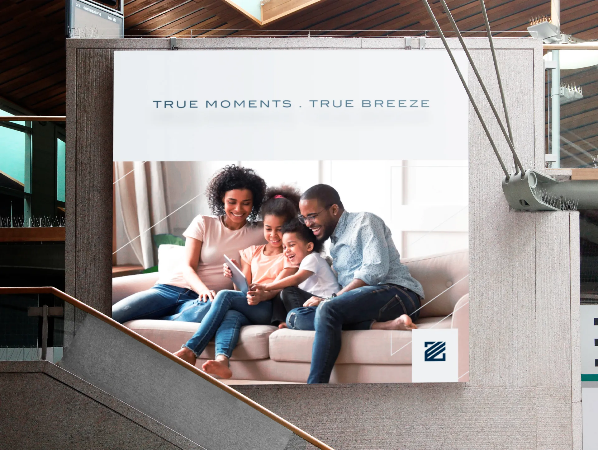

True Breeze is an American air-conditioning company that needed a strong identity, clearly different from its competitors.
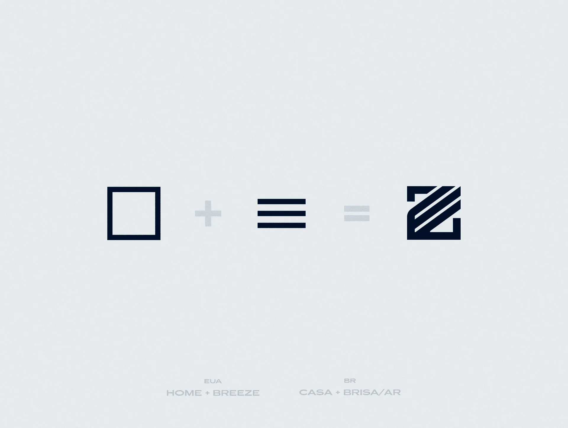
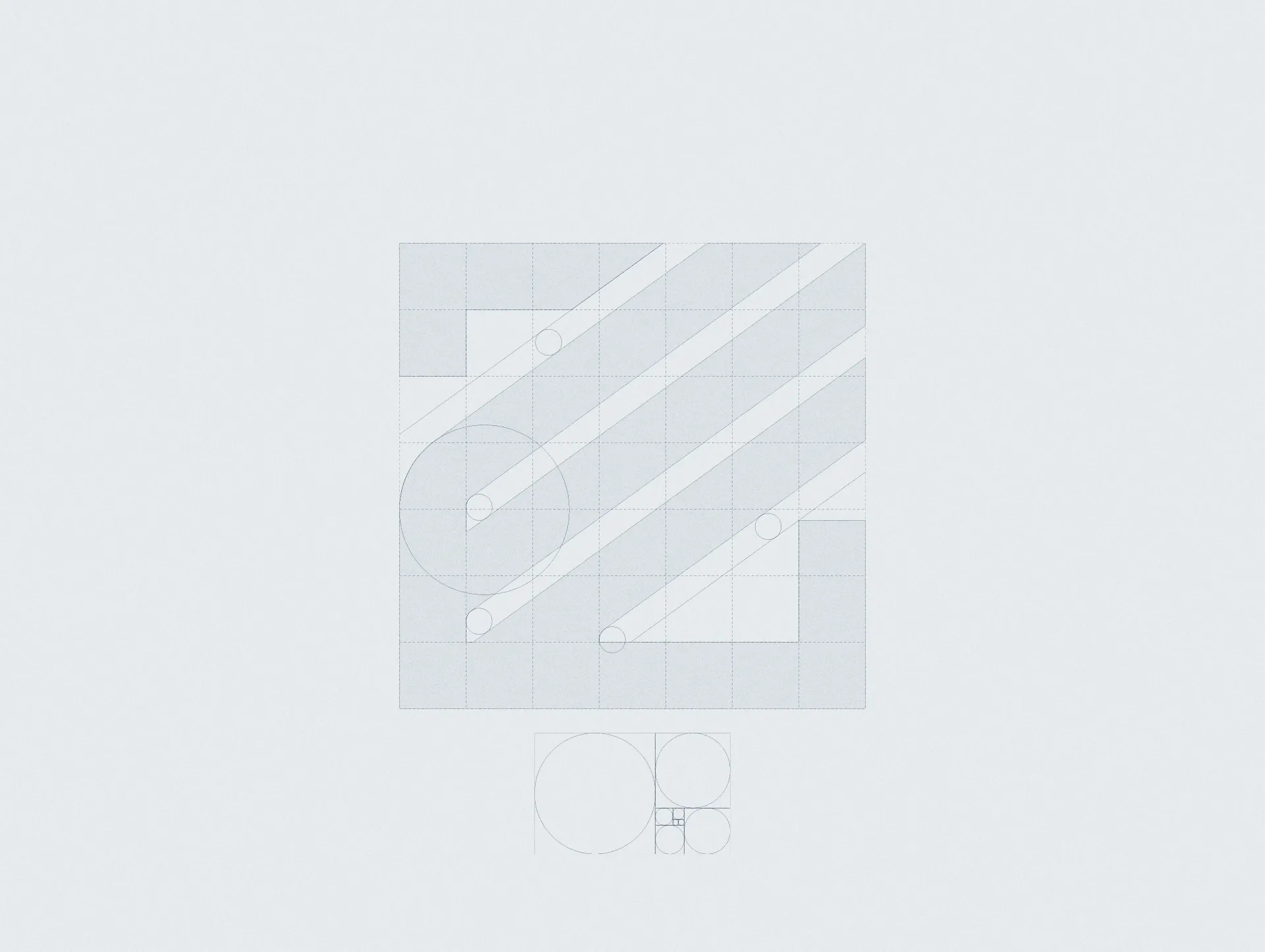
Running away from the industry clichés, the symbol combines a house with the shape of the wind. The house is where families feel the product most; the wind is the freshness it brings, and a direct link to the word 'breeze'. The result is strong, reliable and serious, exactly how the company wants to be seen.