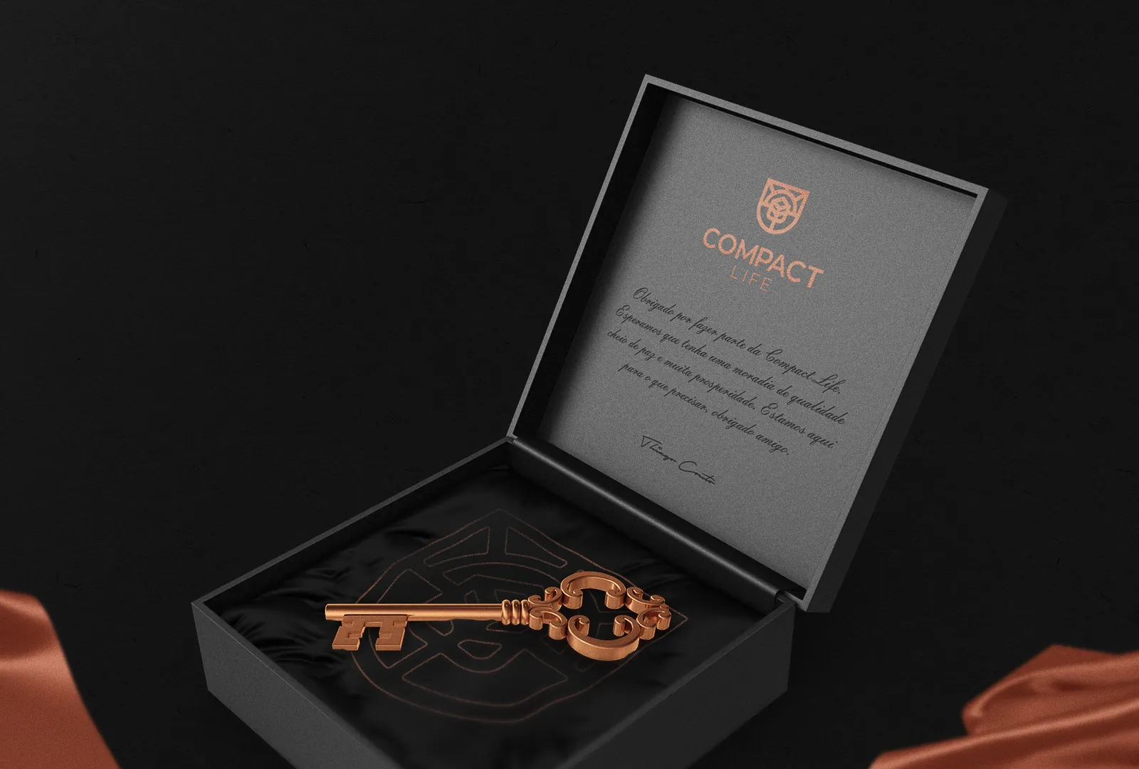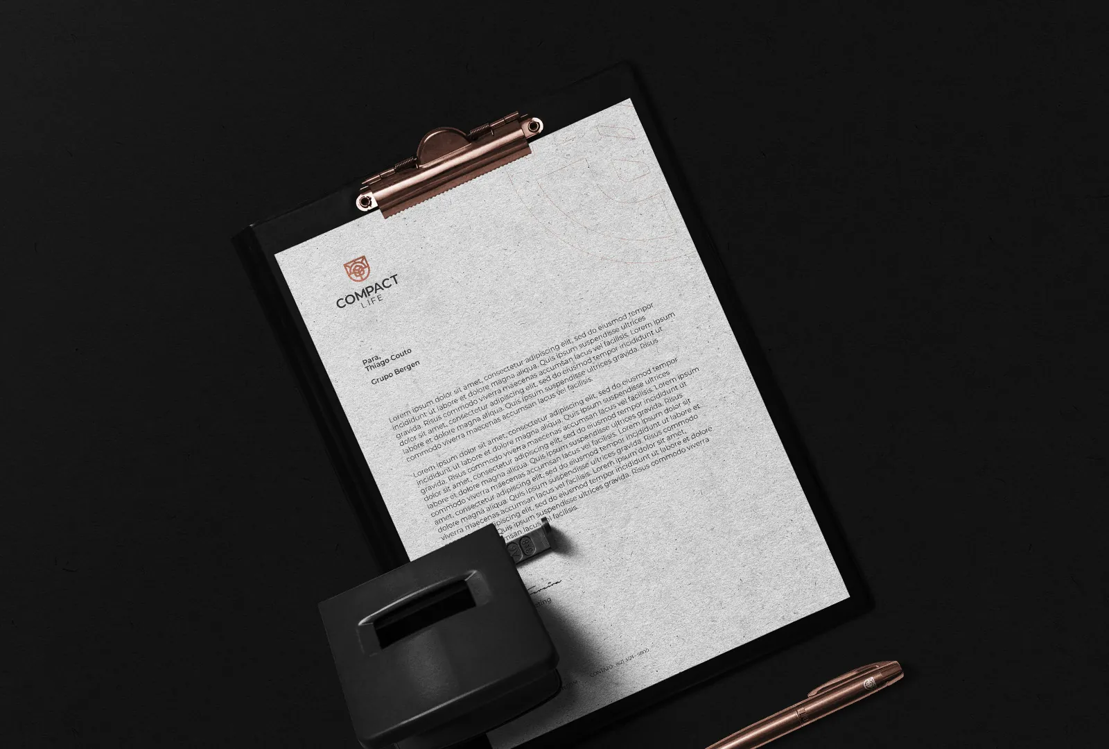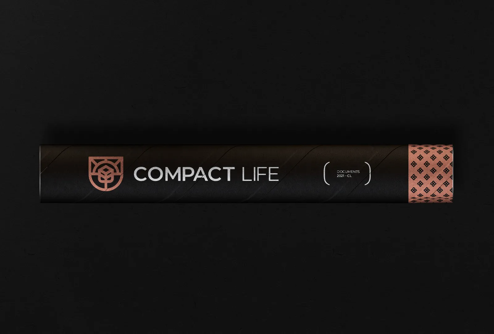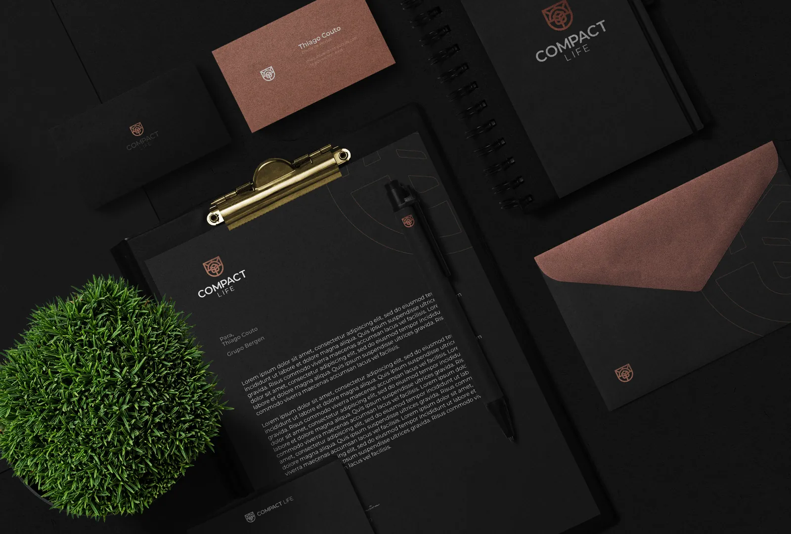

Compact Life is a line of exclusive, elegant real-estate ventures. Its identity is clean and carries that exclusive tone.
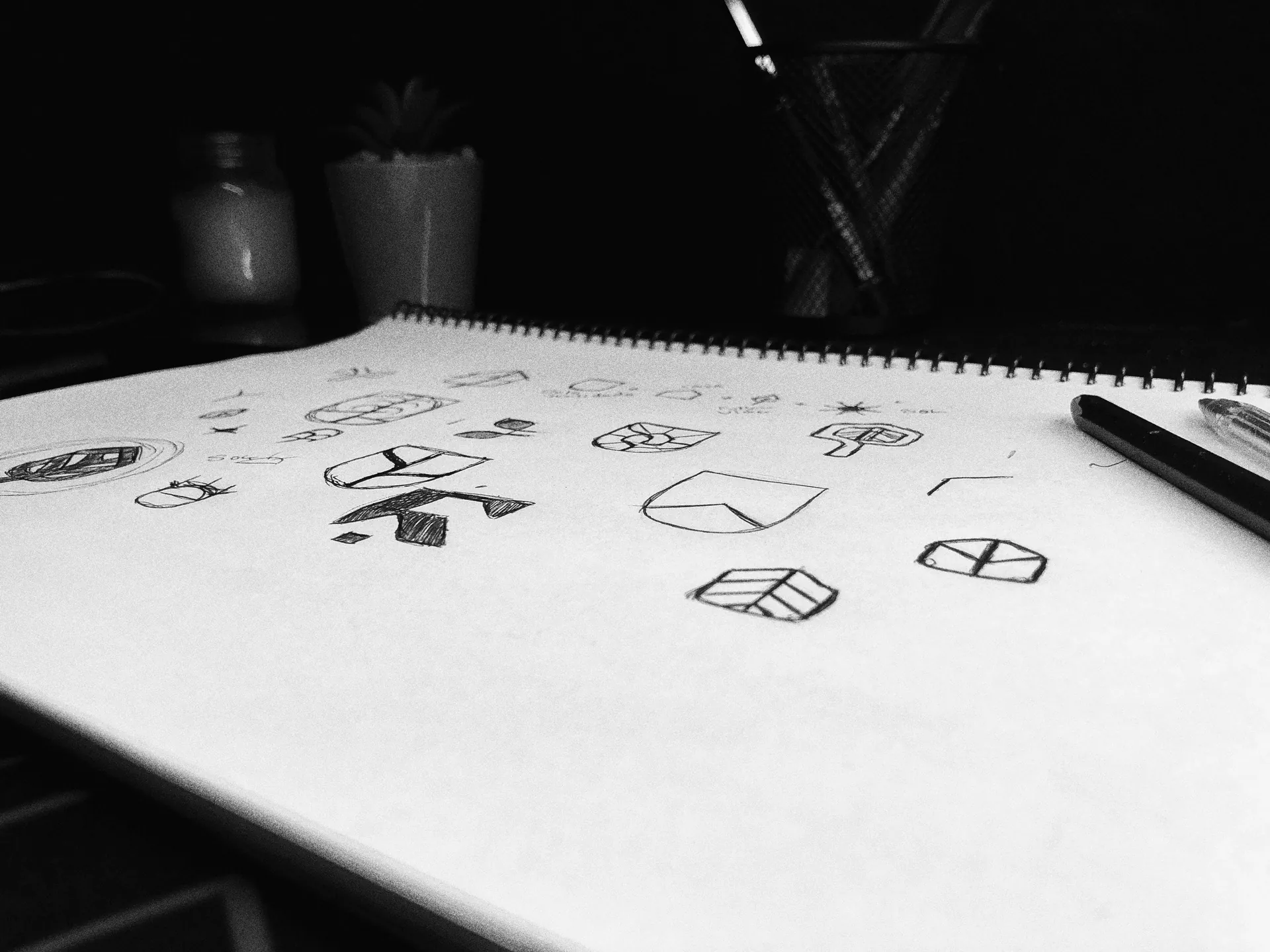
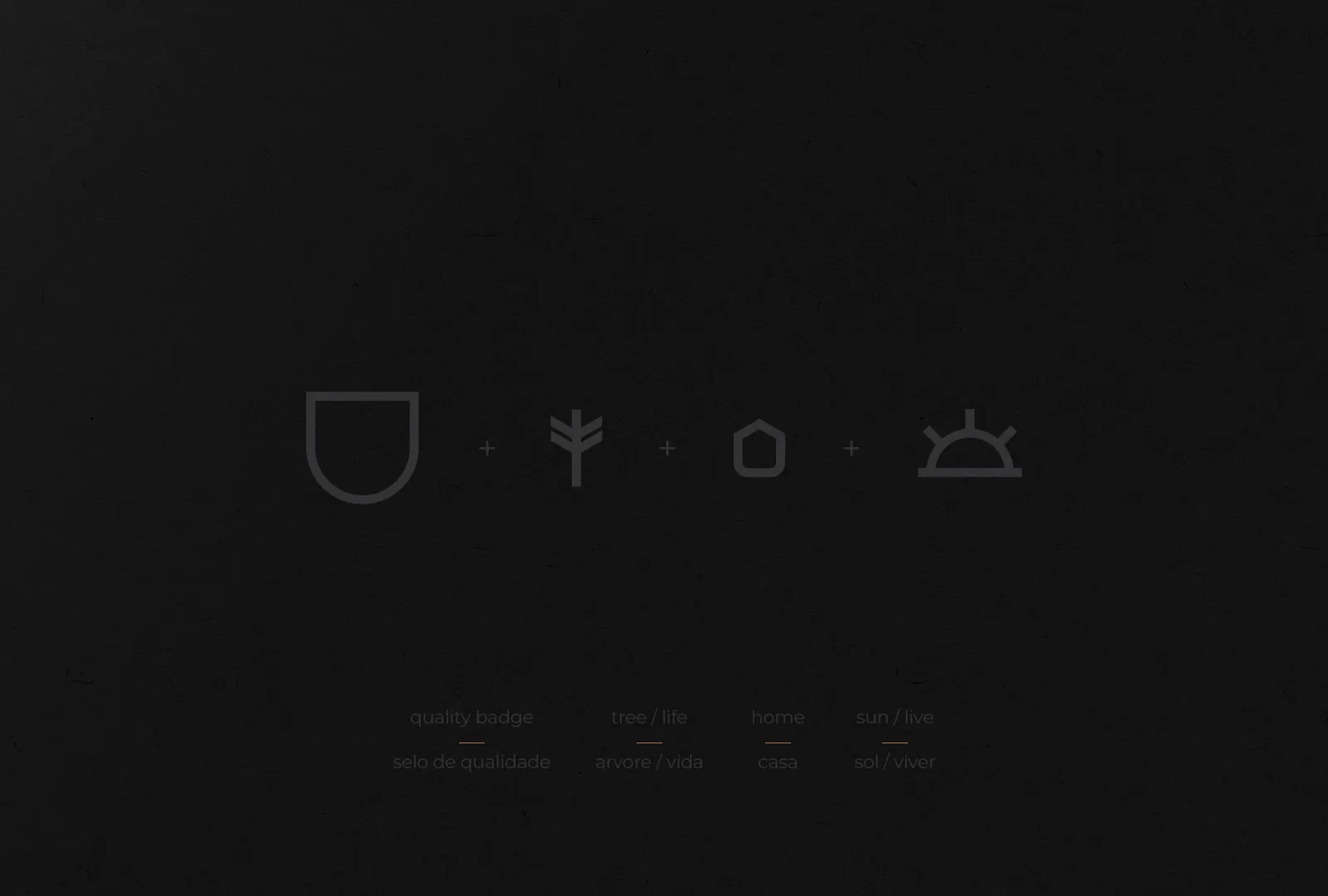
The symbol unites four ideas: a seal for exclusivity and quality, a house for the homes themselves, a tree for life, and a sun for every new sunrise. Together they form one minimal, elegant mark. Copper tones bring elegance, a light sans serif keeps it balanced, and a darker overall identity gives it a serious tone.